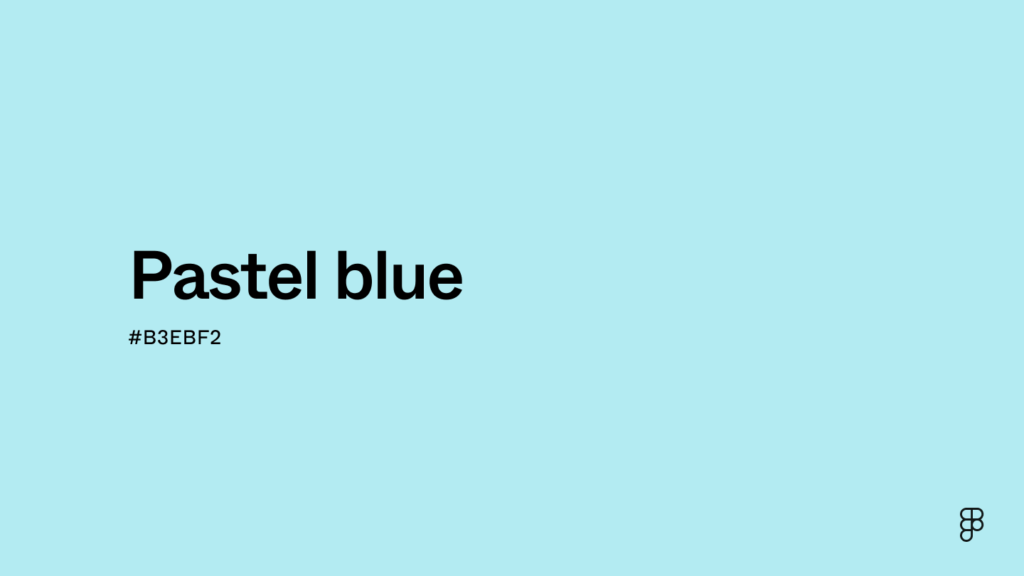
What Is Pastel Blue?
Pastel blue is a soft, light shade of blue that exudes calmness and serenity. It is a pale tint that results from mixing blue with white, creating a delicate and soothing color. Pastel blue is widely used in design, fashion, and interior décor due to its relaxing and versatile nature.
Why Is Pastel Blue Important?
Pastel blue holds significance in multiple fields, from psychology to branding. Here’s why it matters:
- Calming Effect: Known for its soothing properties, pastel blue reduces stress and promotes tranquility.
- Versatility: It complements a wide range of colors and styles.
- Symbolism: Often associated with peace, trust, and clarity.
- Popular in Design: Used extensively in art, fashion, and marketing.
Why Is Pastel Blue Trending?
In recent years, pastel blue has become a trendy choice for many reasons:
- Minimalist Aesthetic: Fits well with modern and minimalistic design trends.
- Soft and Elegant Appeal: Gives off a sophisticated yet subtle look.
- Social Media Influence: Frequently seen in Instagram and Pinterest aesthetics.
- Popular in Fashion: A staple in seasonal collections for its timeless charm.
Benefits of Pastel Blue
Pastel blue offers several benefits, making it a favorite color across different industries:
- Enhances Focus: The cool tone helps in improving concentration.
- Creates a Relaxing Atmosphere: Ideal for bedrooms and workspaces.
- Gender-Neutral Appeal: Works well for all genders in clothing and décor.
- Complements Other Pastel Shades: Matches beautifully with pastel pink, lavender, and mint green.
Why Use Pastel Blue?
There are many reasons to incorporate pastel blue into your life:
1. In Interior Design
- Makes spaces feel larger and airier.
- Pairs well with neutral and warm tones.
- Works great in nurseries, bedrooms, and bathrooms.
2. In Fashion
- Perfect for summer and spring outfits.
- Creates a fresh and sophisticated look.
- Matches well with both light and dark colors.
3. In Branding and Marketing
- Conveys a trustworthy and professional image.
- Commonly used by tech and wellness brands.
- Attracts a broad audience with its universal appeal.
4. In Art and Design
- Offers a soft and dreamy aesthetic.
- Enhances the visual appeal of digital graphics.
- Used in watercolors, paintings, and creative projects.
Conclusion
Pastel blue is more than just a color; it’s a symbol of tranquility and elegance. Whether in fashion, home décor, or branding, its versatility and calming nature make it a timeless choice. Embrace pastel blue in your daily life to add a touch of serenity and style!
Also Read: The Process of Booking a Private Jet: What to Expect
FAQs
1. What colors go well with pastel blue?
Pastel blue pairs well with white, grey, soft pink, mint green, and beige.
2. Is pastel blue a cool or warm color?
Pastel blue is a cool color, making it ideal for creating calming and serene spaces.
3. How can I incorporate pastel blue into my home?
You can use pastel blue in wall paint, furniture, curtains, and décor accents.
4. Is pastel blue suitable for all skin tones?
Yes! Pastel blue complements various skin tones and adds a fresh look to outfits.
5. Why is pastel blue popular in baby rooms?
Its soft and calming nature makes it perfect for nurseries, promoting a peaceful environment.
6. Can pastel blue be used in corporate branding?
Absolutely! Many tech and healthcare brands use pastel blue for its trustworthy and professional appeal.
7. What emotions does pastel blue evoke?
It evokes feelings of peace, clarity, relaxation, and trust.