
RAL, NCS and Pantone: which colour system to use when
RAL, NCS and Pantone describe colour in different ways for different trades. Here is what each one is good at and why conversions are only ever nearest matches.
 By Lotte Brandsma8 minute read
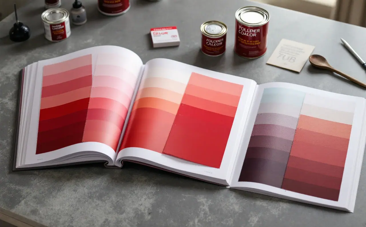
Sooner or later most colour jobs involve more than one trade. A designer works in print, a fabricator sends steel to a powder coater, a decorator mixes wall paint, and each of them reaches for a different reference book. The three names that come up most in Europe are RAL, NCS and Pantone. They are not three spellings of the same thing. Each was built for a different kind of work, each writes colours down in its own way, and none of them translates perfectly into the others.
This is a practical comparison: what each system is, who tends to use it, where it is strong and where it lets you down. Then a worked case with one brand red that has to survive a printed sign, a coated steel frame and a painted wall.
The short version
| RAL Classic | NCS | Pantone | |
|---|---|---|---|
| How a colour is written | "RAL" plus four digits, for example RAL 3020 | A notation such as NCS S 1050-Y90R | A guide number with a suffix that depends on the guide and the material |
| What the code means | A catalogue number; the first digit gives the colour family | A description of how the colour looks: blackness, chromaticness and hue | A catalogue number within a particular guide |
| Size | Roughly 200 colours | Around 1,950 standard samples, with the notation able to describe colours in between | Several thousand across its different guides |
| Who uses it most | Powder coaters, industrial paint, metal and plastic products, doors, windows, machinery | Architects, interior specifiers, many Scandinavian and northern European paint shops | Graphic designers, printers, packaging, textiles and fashion |
| Main strength | Short, widely understood codes; many coatings are stocked in RAL colours | Codes that describe appearance, so similar colours have similar codes | Precise communication for printed graphics and inks |
| Main limit | Small range with gaps; the number says nothing about how the colour looks | Long codes that put people off; less common for industrial coatings | Built around inks, paper and fabric, not paint or powder |
RAL Classic: a numbered collection
RAL Classic is a collection, not a map. Each colour has a four-digit number, and the first digit tells you the family: 1 for yellows and beiges, 3 for reds, 7 for greys, 9 for whites and blacks, and so on. Beyond that, the numbers carry no information. RAL 3020 traffic red and RAL 3022 salmon pink are two numbers apart and look nothing alike.
What RAL Classic has going for it is reach. Powder coaters keep RAL powders on the shelf, window and door makers offer RAL frame colours, and machinery and street furniture are often specified by RAL number. If you need a steel part coated in a standard colour, "RAL 7016, satin" is an instruction most coaters understand at once. The limits are just as clear: about 200 colours with gaps between them, and no gloss information in the number. If your colour falls between two RAL shades, the system simply has no answer.
Reading a RAL deck properly is a skill of its own, and there is a separate guide on how to read a RAL fan deck for that.
NCS: a notation for how colours look
The Natural Colour System comes from Sweden and starts from a different question: how does a person describe a colour? It uses six elementary colours (white, black, yellow, red, blue and green) and places every other colour by how much it resembles them.
A typical NCS code such as S 1050-Y90R reads like this:
- 10 is the blackness, how much the colour resembles black.
- 50 is the chromaticness, how strong the colour is.
- Y90R is the hue: yellow with 90 per cent red, so a red with a slight yellow lean.
Whiteness is whatever is left over to make 100, so this example has a whiteness of 40. Neutral greys use N in place of a hue, as in S 2000-N. The S at the front marks a standard sample.
That structure is the system's great strength. Two colours with similar NCS codes look similar, and you can ask for "the same hue, but a little darker" and write it down. Architects and interior specifiers like it for exactly that reason, and many paint shops in Scandinavia and elsewhere mix to NCS codes as a matter of course. The weakness is that the codes look intimidating to anyone outside the trade, and NCS is far less common than RAL among powder coaters and industrial finishers. The notation also describes appearance; it is not a paint recipe. Two paint makers can mix the same NCS code from quite different pigments.
Pantone: a system for graphics, print and textiles
Pantone is the reference most designers know first. Its best-known guides are for printing inks, with separate versions for coated and uncoated paper because the same ink looks different on each. Other Pantone guides cover textiles, fashion, interiors and plastics, each with its own numbering and suffixes.
For a printer, a Pantone reference is precise and practical: it points to a specific ink and how it should look on a given paper. For a powder coater or a decorator, it is much less helpful. Paints and powders are made from different pigments and binders from printing inks, and a printed patch on paper may describe a colour that a coating cannot reach at all, or can only reach with a very different finish. You can name Pantone in a specification for the printed parts of a job, but a Pantone guide is not a coatings reference.
Why conversions are always nearest matches
Every conversion between these systems is a nearest match, never an equivalence. The three systems sample colour at different points. A RAL colour might fall between two NCS samples, and a Pantone ink might fall between several RAL shades or outside the RAL range entirely. A conversion table is made by someone measuring the colours, calculating the colour difference between candidates, and picking the closest. Use a different measuring method, a different light source or a different set of samples, and you get a different "equivalent".
That is why two converters often disagree, and why neither is wrong. The match lab on this site works the same way for screen values: give it a hex code and it suggests the nearest RAL Classic colours, which are a starting point for looking at real samples, not a substitute for them.
Worked case: one brand red, three materials
Say a small bakery has a red logo. The designer has defined the brand red for printing, in the brand guidelines, as a spot ink. Now three things need making: a printed sign panel, a powder-coated steel frame that holds the sign, and a feature wall inside the shop.
Here is how I would handle it.
- Pick one master reference. Get a printed sample of the brand red on the actual sign material, not a screen file. That physical sample is the thing everything else is compared with.
- Choose the coating colour by eye, not by table. Take the master sample outside in daylight and lay it flat next to the red strips in a RAL Classic fan deck. A converter might suggest a few candidates to look at first. For many bright brand reds, RAL 3020 traffic red is a sensible first comparison; on screens this site shows it as roughly #C1121C, which is only an approximation. Compare it with its neighbours too: RAL 3000 flame red is deeper and a little browner, RAL 3028 pure red is lighter and leans more towards orange. Pick the one that looks closest to the master, and accept that it will be close rather than identical.
- Choose the wall colour the same way. The decorator's paint shop may mix to a RAL number or an NCS code. Lay the master sample next to their NCS samples or a card mixed to RAL 3020 and pick the nearest. Strong reds in wall paint often cover poorly, so ask whether the shop recommends a tinted primer and how many coats to plan for.
- Make physical samples of all three. A sprayed panel from the powder coater, a painted card from the decorator, the printed sign proof. Put them together outdoors in daylight and then indoors under the shop's own lights.
- Expect the finishes to differ. A gloss powder-coated frame, a matt emulsion wall and a printed vinyl panel will never look identical even when the colour is right, because sheen changes how deep a red appears. Judge whether they belong together as a family, not whether they are clones.
- Write it all down. Frame: RAL 3020, gloss level agreed with the coater. Wall: the mixed code and sheen from the paint shop. Sign: the brand spot ink from the guidelines. Keep the approved samples in the job file.
The brand red now exists as three references in three systems. None of them is "the" brand red; the printed master is. The others are the nearest each material can do.
Questions readers ask
Can I convert an NCS code to an exact RAL number?
No. You can find the nearest RAL Classic colour to an NCS code, and sometimes the two are very close, but they are different samples made for different systems. Always compare physical samples before ordering.
Why does my online converter give a different RAL to the one the paint shop suggests?
Because each was worked out with different measurements and different rules for what counts as nearest. The paint shop's suggestion may also reflect what their mixing system actually produces well. Trust a physical comparison over either number.
Which system should I use to specify colours for a building?
It depends on who has to make the colour. Metal frames, doors and cladding are usually ordered by RAL number. Interior walls are often specified in NCS, particularly in northern Europe. If a printed brand colour is involved, give printers the brand's own print reference and give the coating trades a chosen RAL or NCS nearest match.
Does a Pantone guide replace a RAL fan deck?
Not for coatings. A Pantone guide shows printing inks or textile colours, and a powder coater or decorator works from RAL or NCS references. Keep each guide for the trade it was made for. For more on how colours shift between screens, paper and paint, browse the screens and print notes.
Lotte Brandsma
Lotte writes about the gap between a colour code and the colour you see: screens, print, fan decks and the NCS and hex numbers people mix up. She lives in Utrecht and keeps a well-thumbed fan deck beside the keyboard.
More from the same drawer

Luminous RAL colours and why screens cannot show them
The five luminous RAL Classic shades glow because their pigments turn invisible light into colour. Here is why no screen can show them and how to paint them.
Read the note
How to read and use a RAL fan deck
What the strips in a RAL Classic fan deck tell you, how to hold one against a wall or a part, and how to store it so the colours stay worth trusting.
Read the note
Why RAL colours look different on every screen
A RAL number names a physical colour, but your laptop and phone each redraw it their own way. Here is why the hex values drift and what to trust before ordering.
Read the note