
Doors, windows and railingsColour at home
RAL 9016 or RAL 9010: choosing a white
RAL 9016 traffic white is cool and bright, RAL 9010 pure white a shade warmer. Where each turns up, how 9001 and 9003 compare, and how to test whites on a facade.
 By Bram Visser7 minute read
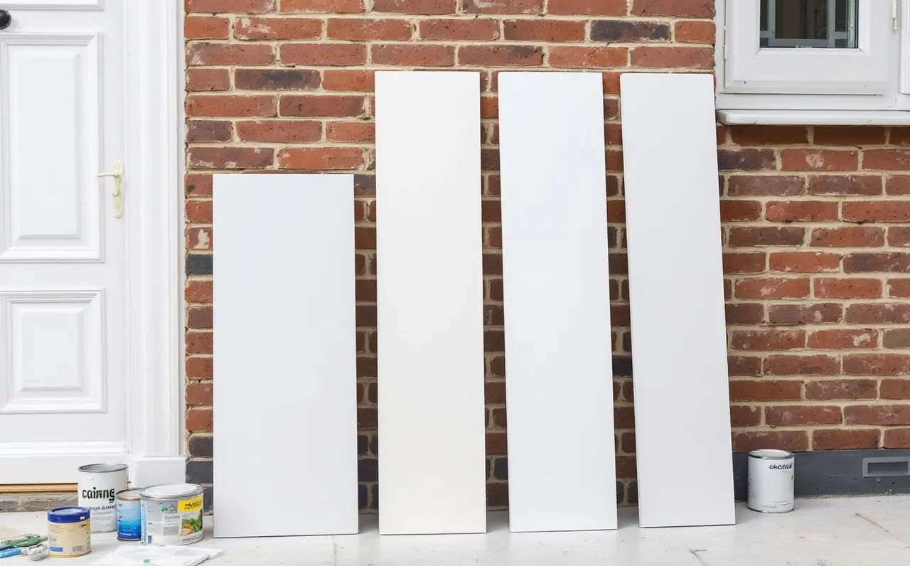
Whites are the colours people choose fastest and regret most quietly. Nobody agonises over "white" the way they do over a green front door, so the order goes in, the frames arrive, and only then does someone notice that the new windows look slightly blue next to the old porch, or the door looks yellow next to the new windows. Usually the cause is two different RAL whites sitting side by side.
The two that come up most often are RAL 9016 traffic white and RAL 9010 pure white. They are close enough to be confused on a screen and different enough to show on a house. This piece compares them, adds RAL 9001 cream and RAL 9003 signal white for context, and ends with how I would test them before anyone signs an order.
The short version
RAL 9016 traffic white is a bright, clean white with a slightly cool character. It is one of the most common whites on uPVC and aluminium windows and doors, and many frame makers treat it as their standard white.
RAL 9010 pure white is a little warmer and a touch softer. It is common on painted timber joinery, interior doors, skirting and wall paint, and some window makers offer it as an alternative white.
Neither is "whiter" in any useful sense. They lean in different directions, and which one looks right depends on what sits next to it.
Four whites side by side
The hex values here are this site's approximations for screens. They help to compare the whites with each other on one display, but whites are where screens are least trustworthy: a tiny shift in the screen's own white point changes the whole impression. Judge them on painted samples.
| RAL shade | Screen approximation | Character | Where you often see it |
|---|---|---|---|
| RAL 9016 traffic white | F7FBF5 | Bright, clean, slightly cool | uPVC and aluminium windows, doors, cladding, garage doors |
| RAL 9010 pure white | F7F9EF | Bright, slightly warm, soft | Timber joinery, interior doors, trim, walls, some frames |
| RAL 9003 signal white | FFFFFF | Very bright, crisp, neutral to cool | Signs, panels, furniture, appliances, some interiors |
| RAL 9001 cream | EFEBDC | Clearly warm, pale cream | Traditional joinery, kitchens, heritage-style frames |
Look at the last two characters of each hex value, the blue channel. In RAL 9016 it is a little higher relative to the others than in RAL 9010, which is part of why 9016 reads cooler. RAL 9001 drops the blue further and becomes an obvious cream. On paper these differences are small numbers; on a wall in daylight they are easy to see.
Where RAL 9016 earns its place
RAL 9016 traffic white looks fresh and sharp, which suits modern frames and clean architecture. Because so many window, door and cladding makers use it, it is also the easy white to match later. If you are adding a window to a house where the existing frames are white uPVC, there is a good chance they are 9016 or very close to it, although you should check the paperwork or ask the original supplier before relying on that.
The coolness that makes 9016 crisp can work against it next to warm materials. Against honey-coloured stone, warm red brick or an older cream render it can look slightly blue, particularly on an overcast day. Next to grey render, grey slate and dark grey frames it tends to look exactly right.
Where RAL 9010 earns its place
RAL 9010 pure white is softer. It does not shout, and inside a house that is often what people want: it looks clean without the slightly clinical edge a cooler white can have under artificial light. That is why it turns up so often on interior doors, skirting boards and painted joinery, and why it pairs well with warm timber floors.
Outside it suits older buildings, warm brick and painted timber windows. Next to brand new 9016 frames it can look a shade creamy, which is the most common complaint about mixing the two.
Signal white and cream as reference points
RAL 9003 signal white is the one to look at if you want maximum brightness. It is very crisp, sometimes almost
stark, and is more common on signs, panels and furniture than on house fronts, though some people use it on
modern doors and gates. On a screen it often appears as pure #FFFFFF, which only shows how little a screen can
tell you about whites.
RAL 9001 cream is different in kind: it is not a white with a hint of warmth, it is a pale cream. It is useful as a reference because putting it beside 9010 makes 9010's warmth easier to see. It is also a popular choice for heritage-style joinery and kitchens where a white would feel too new.
Mixing whites on one facade
Most houses end up with more than one white whether anyone planned it or not: the windows from one supplier, the front door from another, the fascia boards from a third, the render painted by whoever was available. A few rules help.
- Decide which element sets the white. On most houses it is the windows, because there are the most of them and they are the hardest to change.
- Match elements that touch. A door frame and the door in it, or a window and its sill trim, should be the same white. Two whites butted together are where a difference shows most.
- Separate different whites with something else. A white door in 9010 set into brickwork, a little way from 9016 windows, rarely bothers anyone. The same door in a 9016 frame often does.
- Keep gloss in mind. A high gloss 9016 and a satin 9016 can look like two whites, because the gloss one reflects the sky. Ask for the same gloss level where two parts meet.
- Remember that whites age. Paints and coatings can yellow or chalk slightly over the years, and an older 9016 frame may already be warmer than a new one. If you are matching existing frames, compare a new sample against them, not against the catalogue.
How I would test them
Here is the plan I would follow for a typical job: a new front door going into a house with white uPVC windows of unknown age.
Step 1: gather samples
Get physical samples of RAL 9016 and RAL 9010 in the finish the door will have. A door maker or paint supplier can often provide small painted panels or offcuts. A printed chart or a RAL Classic fan deck is fine for narrowing the choice, but for whites a larger painted sample is better, because the eye judges whites by area. How to read the cards properly is covered in how to read a RAL fan deck.
Step 2: look outside, at the house
Hold each sample directly against an existing window frame, then against the wall where the door will go. Do it at midday on an overcast day first, which is the most honest light for whites, then again on a sunny morning and late afternoon. Note which sample disappears against the frame and which one looks like a different white.
Step 3: look from the street
Step back to the pavement. Whites that look different at arm's length sometimes merge at ten metres, and the reverse can happen when one white is in shade and the other in sun. The view from the street is the one most people will see.
Step 4: check the inside face
If the door is painted the same colour inside, hold the samples in the hallway under your own lighting in the evening. Warm bulbs push everything towards cream and make 9016 look whiter by contrast; cool bulbs can make 9016 look icy.
Step 5: decide and write it down
Order by RAL number and gloss level, and record both somewhere you will find them in ten years, along with the supplier's name. The next time a part is replaced, that note saves the whole process.
Questions readers ask
Are RAL 9016 and RAL 9010 close enough to mix?
In separate places on a building, often yes. Touching each other, usually not: the difference shows most where two whites meet on a straight line, such as a door in a frame.
Which white is best for uPVC windows?
RAL 9016 is the common choice and the easiest to match later, but the right white is the one that sits well with the rest of the house. Ask the frame maker which whites they offer, because the range varies between suppliers.
Can I trust the white on my screen?
Not for this decision. Whites depend heavily on the screen's own white point and brightness, and the differences between 9016, 9010 and 9003 are small enough to disappear or be exaggerated on a display. Use the screen to shortlist and painted samples to choose.
Bram Visser
Bram writes about colour on the outside of houses: front doors, window frames, garage doors, fences and railings. He has repainted more Rotterdam doorways for friends than he likes to admit.
More from the same drawer
Touching up chips on powder-coated gates
A chipped powder-coated gate can be touched up at home with wet paint ordered by RAL number and gloss. How to clean, feather and seal a chip before rust spreads.
Read the note
Why RAL colour names change between languages and shops
RAL numbers stay fixed while the names get translated, shortened and reused by shops. Why the four digits are what to quote, plus a checklist for ordering.
Read the note
Grey and olive RAL shades for sheds and outbuildings
Six quiet greys and greens that sit well in a garden, how foliage, brick and sky shift them, and how to test a shed colour before you paint it.
Read the note